It could be an indication that the market has adjusted to a new mortgage stress test introduced on January 1, which is widely assumed to be the cause of the drop.
But is the market starting to heat up again? To get to the bottom of this question, BuzzBuzzNews has rounded up 7 charts to put things in perspective.
1. The market is balancing out

What’s going on here: The RBC Economics team has tracked the national sales-to-new-listings ratio over the past 14 years. A ratio of between 40 to 60 per cent is considered balanced territory, with readings above and below indicating seller’s and buyer’s markets, respectively.
The takeaway: The ratio has fallen into balanced territory, where it appears to be leveling out, instead of descending further into a buyer’s market.
2. Sales are down, but not historically low

What’s going on here: The Canadian Real Estate Association (CREA) has charted national sales activity over the past four years.
The takeaway: While sales are certainly down considerably from where they sat in Q4 2017, they’re above where they were in 2013, a sign that while sales have fallen from last year’s heights, they’re not dangerously low.
3. The GTA market is heating up

What’s going on here: The Toronto Real Estate Board shows how home sales have varied on a month-to-month basis over the past three years.
The takeaway: Sales are inching up month-over-month in the GTA, though they’re still well below previous years. It could be a sign that sales will continue to climb in the coming months.
4. Inventory is up, but historically low

What’s going on here: CREA has charted the sales-to-new-listings ratio against inventory levels over the past four years.
The takeaway: Inventory levels have moved upwards over the past three months, a sign of a cooling market. But it’s worth noting that they’re still well below the historical average, currently sitting at just over five months when they had previously been above six.
5. Prices are still dropping, but not as sharply

What’s going on here: The RBC Economics team has charted the MLS home price index over the past 12 years.
The takeaway: Prices are still falling from their peak last year, but the drop has eased off in recent months, indicating that prices might have bottomed out, and could soon begin to rise.
6. And not every market tells the same story
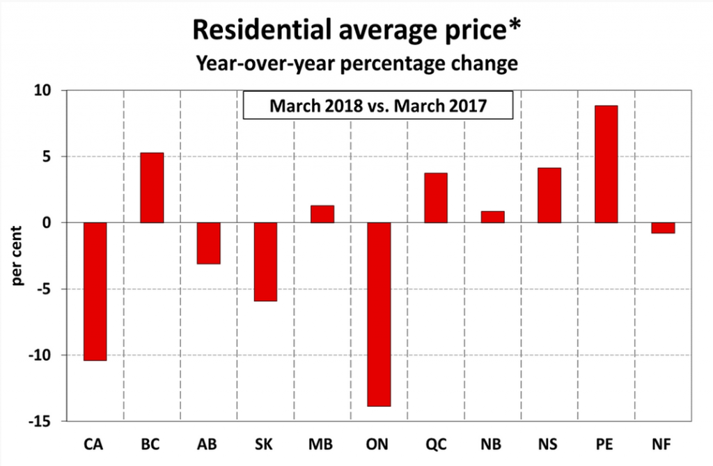
What’s going on here: CREA charts year-over-year price changes in each province, showing the difference that an be found between each.
The takeaway: While Ontario is leading the charge with a serious year-over-year price drop, other provinces tell a different story. Prices in BC, Manitoba, Quebec, New Brunswick and Nova Scotia are all up, while prices in PEI have jumped nearly 10 per cent.
7. Buyers are moving towards lower-priced property types

What’s going on here: Scotiabank Economics tracks the House Price Index for different property types over the last three years.
The takeaway: By separating the HPI into housing types, it becomes clear that part of the drop in prices can be attributed in a shift towards more affordable property types. While the price of a single-family home has plummeted, the decline for townhomes and apartments is much less pronounced.
